
A bold, colorful wine brand where one set of bottle shots is used across the producer's site and regional retail channels.
Built once. Visible everywhere.
Fellow Wines is a small Clarksburg, California producer known for its bold, graphic labels. Geometric shapes, vibrant color blocking, and a hand-lettered logo give each wine its own personality while maintaining a strong family resemblance.
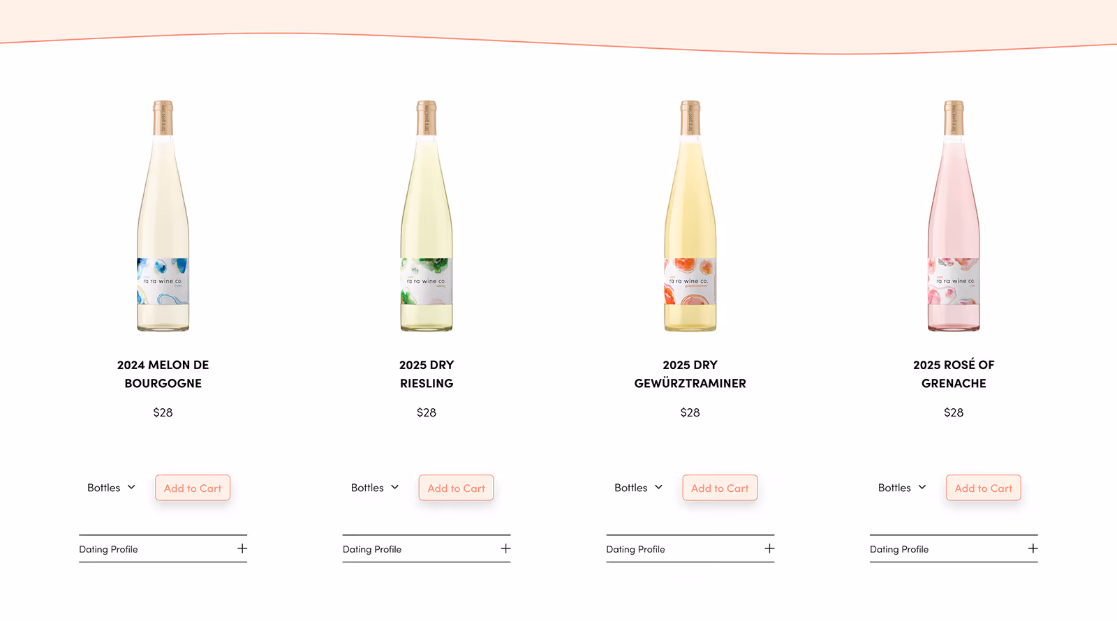
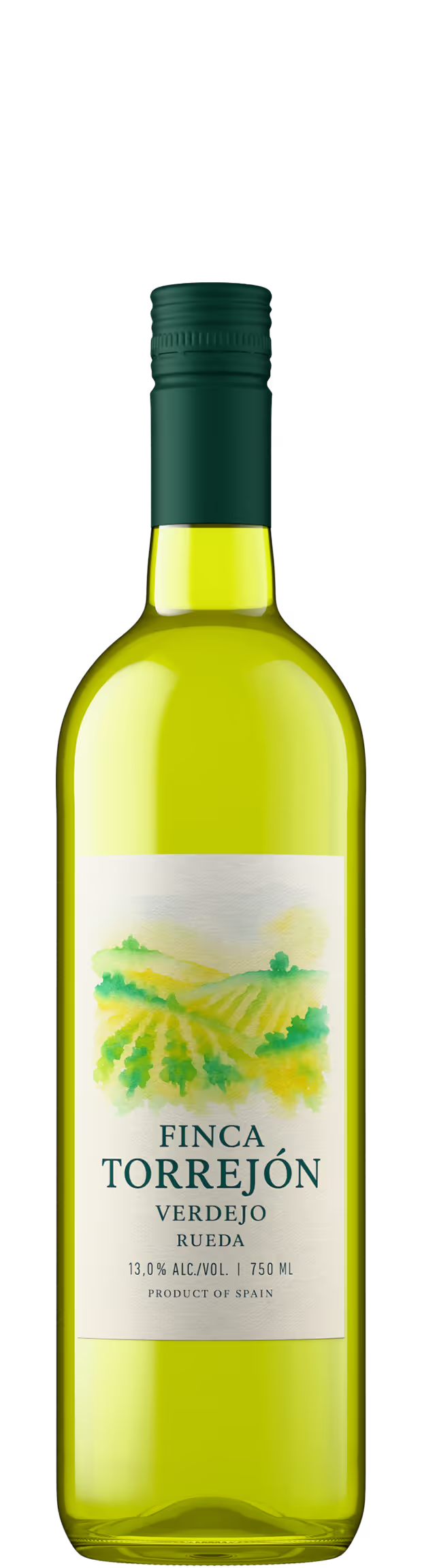
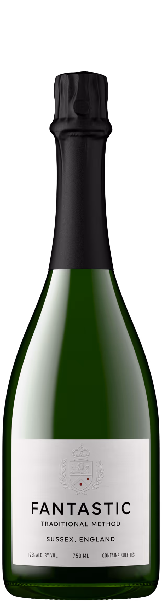
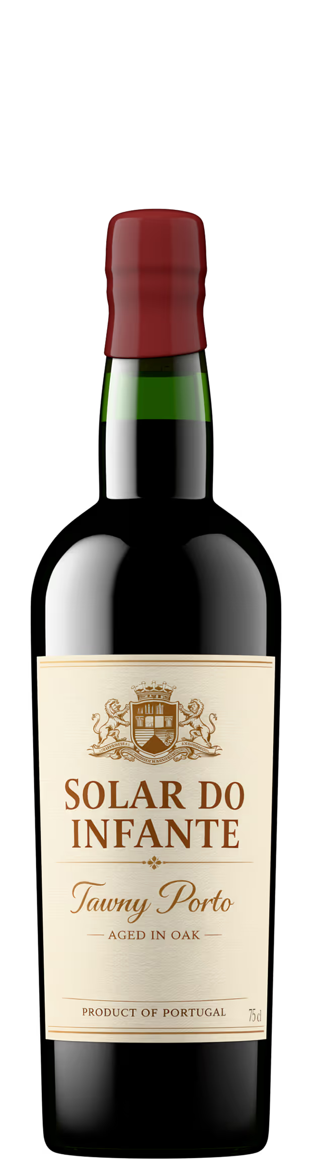
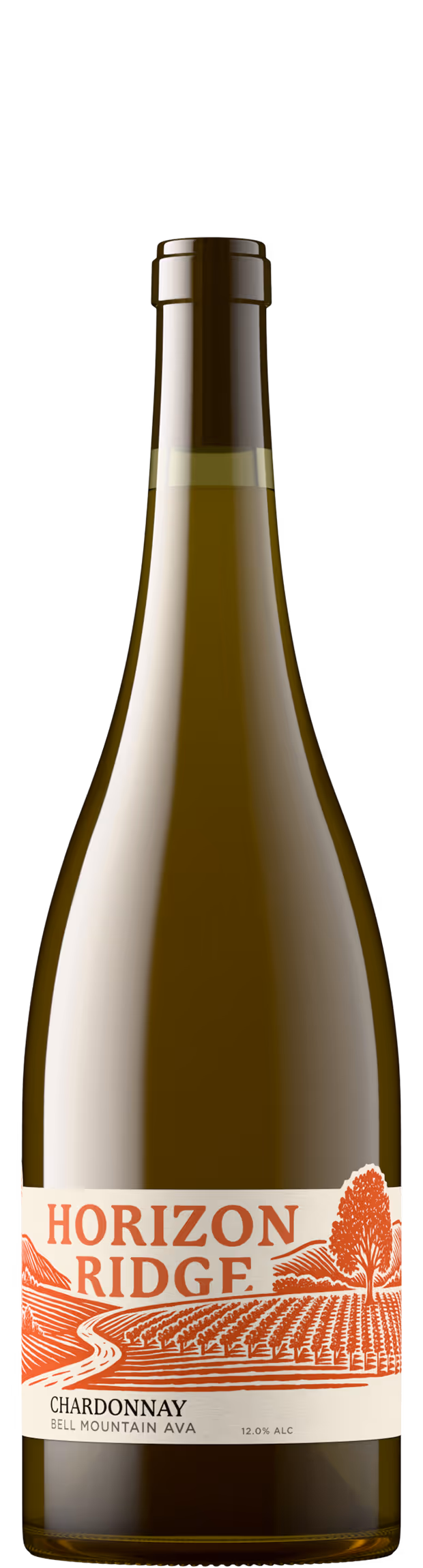
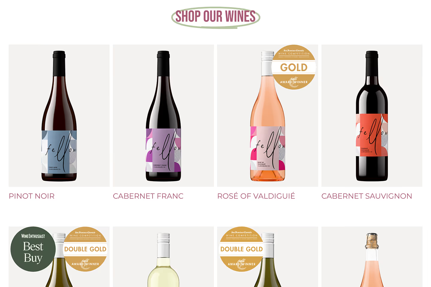
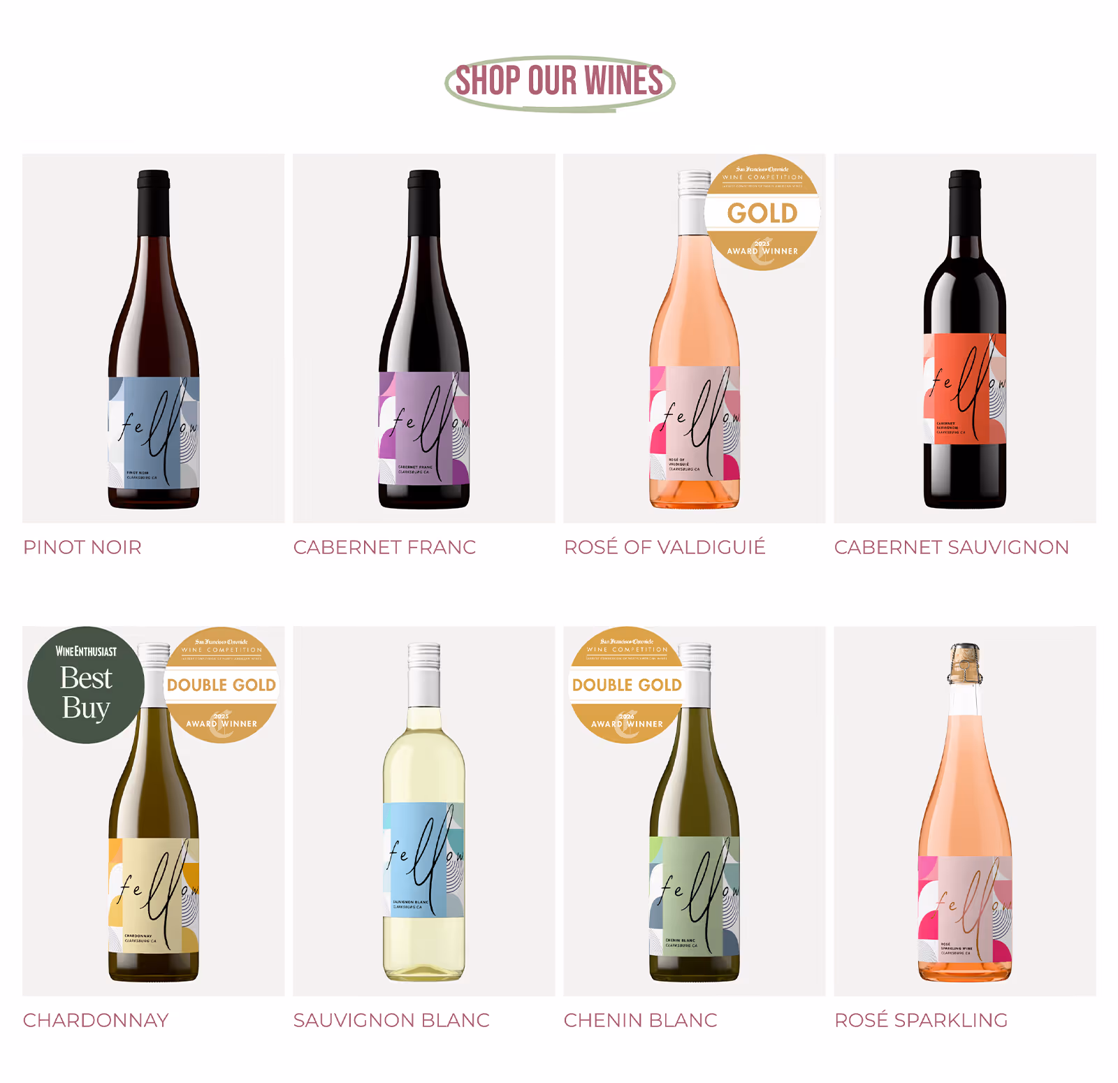
On the homepage, the "Shop our wines" grid shows all eight bottles in a clean, evenly lit row. Each photo shares the same lighting, background, and crop, with glass color shifting correctly between varietals. The label detail is sharp enough to read at a glance.
The real test comes off-site. Fellow's wines also appear on Enjoy Clarksburg, a regional retail platform. The same clean renders hold up within this busier layout without looking out of place. The bottles remain constant while the context changes around them.
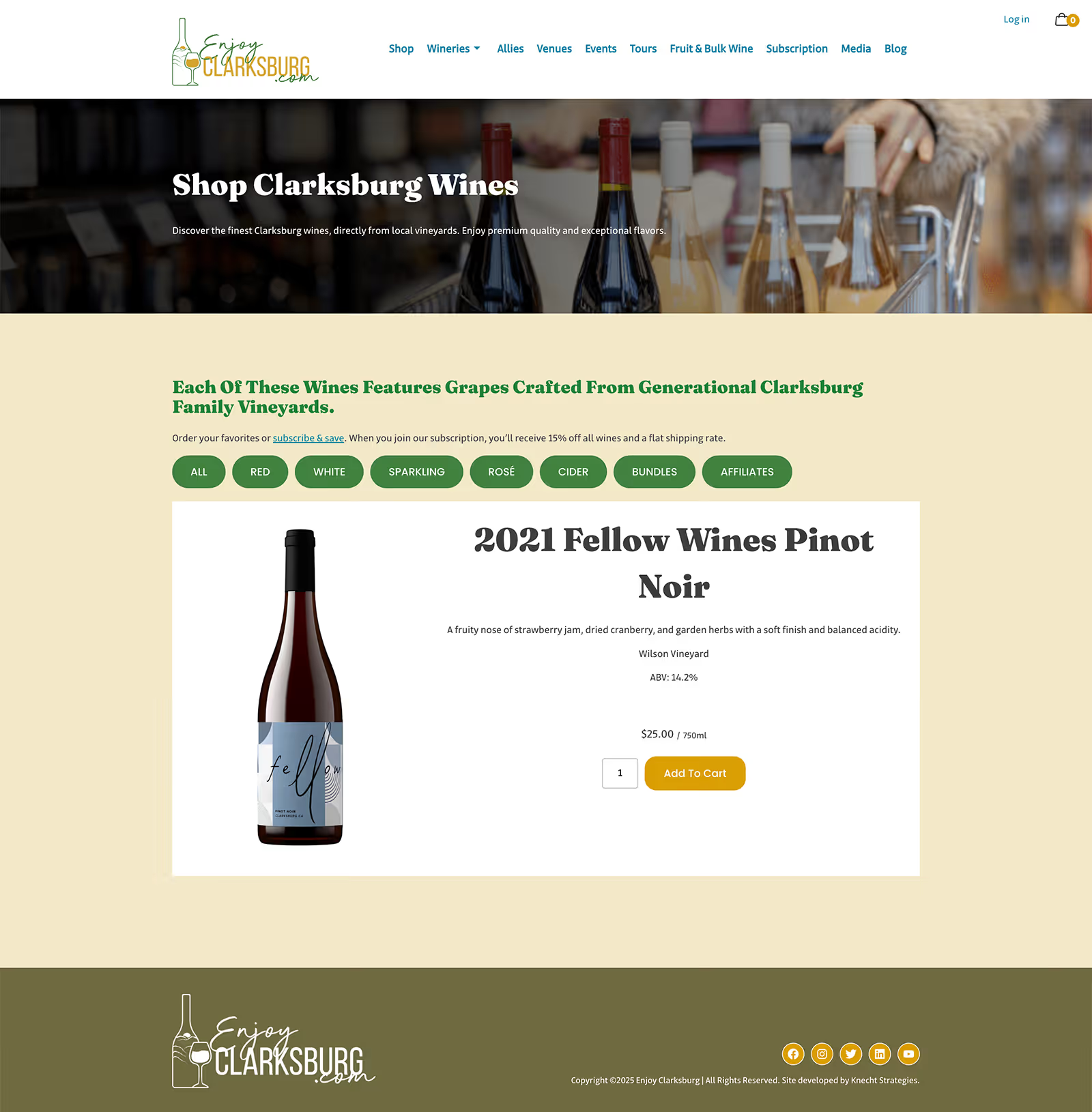
One SKU, the Cabernet Franc, uses a lifestyle photo on the retail site instead of the standard render, which immediately breaks the pattern. The lighting is different, the scale feels off, and the crop doesn't match the rest of the lineup. The eight rendered shots share a visual language, but the lifestyle photo does not.
Fellow's distinctive label design benefits from a rendering approach that stays out of the way. The imagery doesn't compete with the packaging; it presents it clearly, lets the design do its work, and stays consistent wherever the bottle appears.
Build one set of images, use them everywhere: The same renders work across a brand site and a third-party retail channel.
Let the label do the talking: Bold packaging reads best when the imagery stays clean and consistent.
Watch for the odd one out: A single mismatched photo reveals how much consistency the rest of the lineup shares.
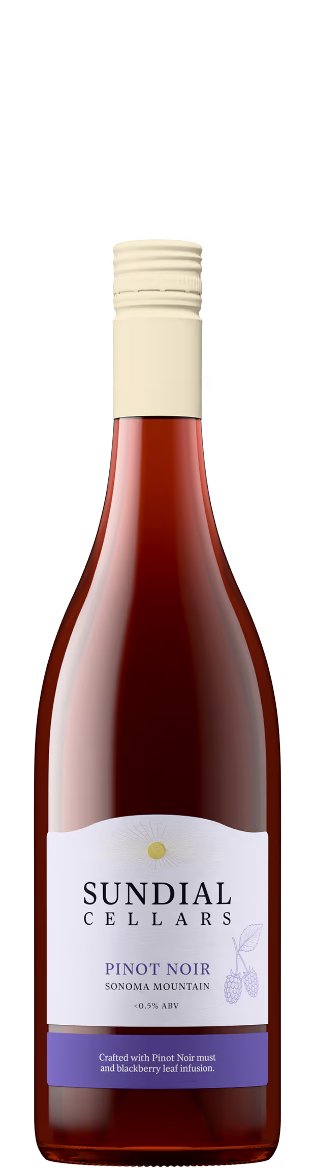
Match closures and glass to reality: Accurate screwcaps, corks, and glass color make renders feel true to the product.
Think beyond your own site: Product images travel. They need to hold up in templates and layouts you do not control.
Treat your full portfolio as a system: When every bottle follows the same visual standard, the lineup sells as a collection, not just individual wines.