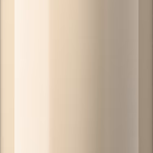
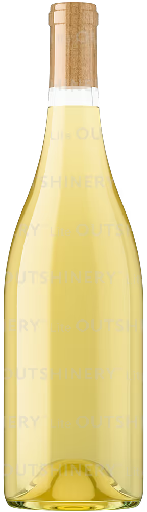
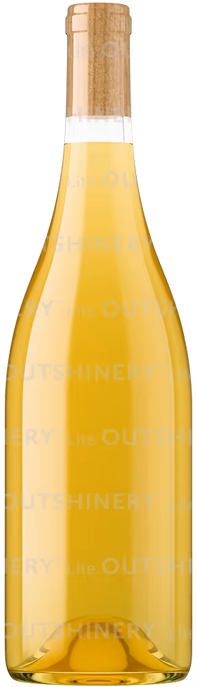
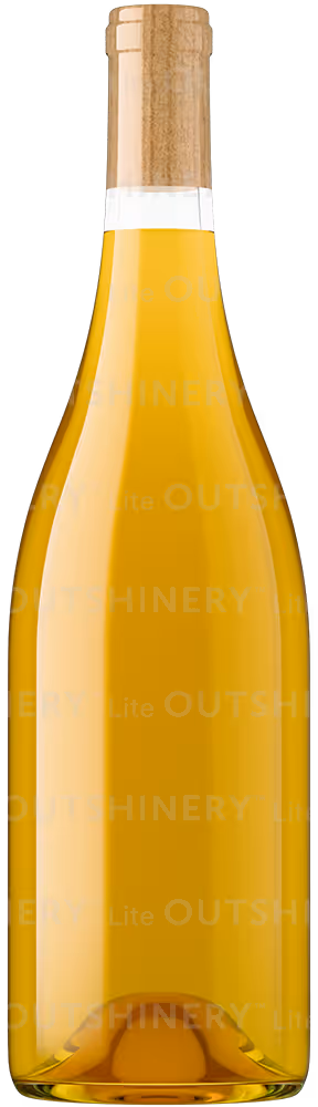
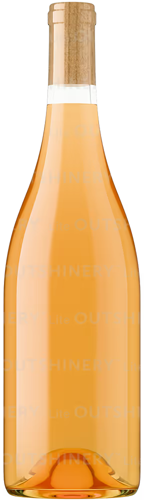
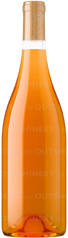
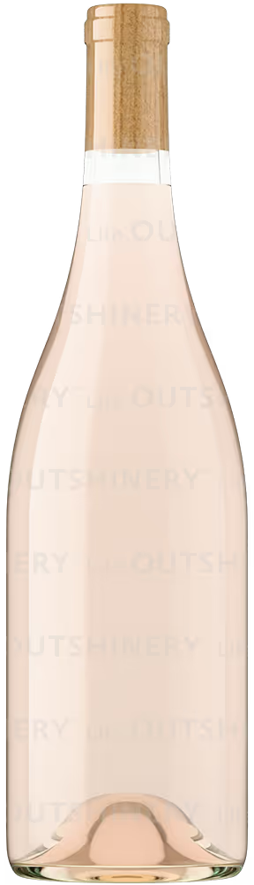
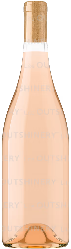
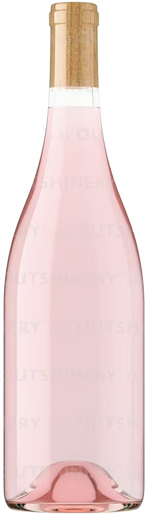
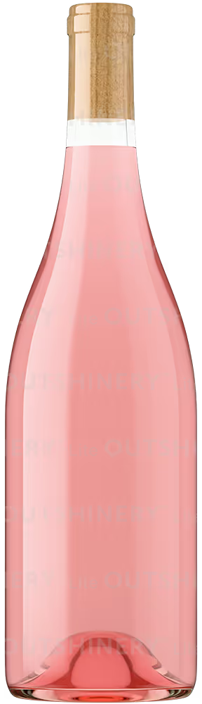
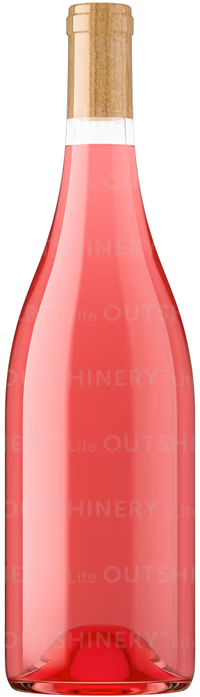
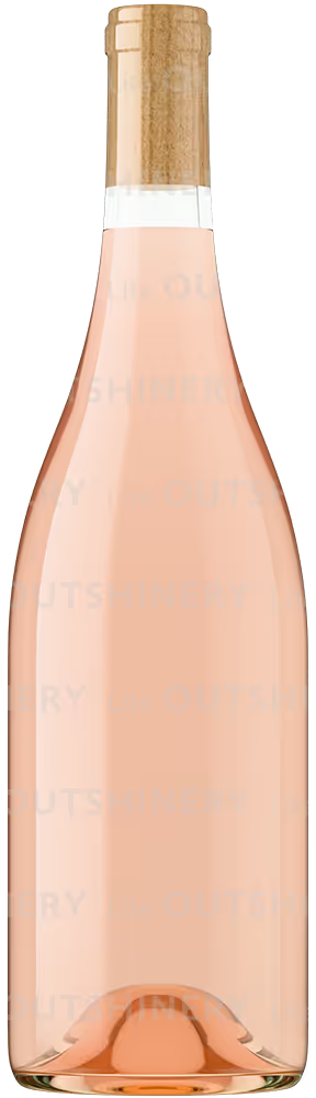
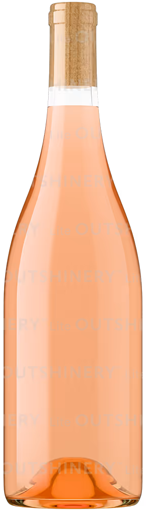
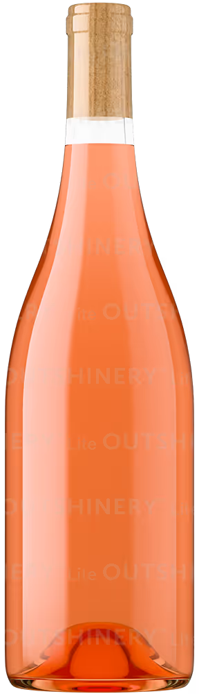
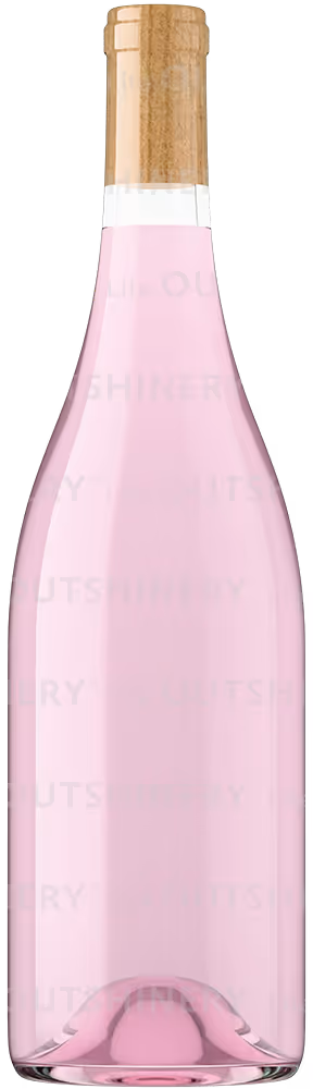
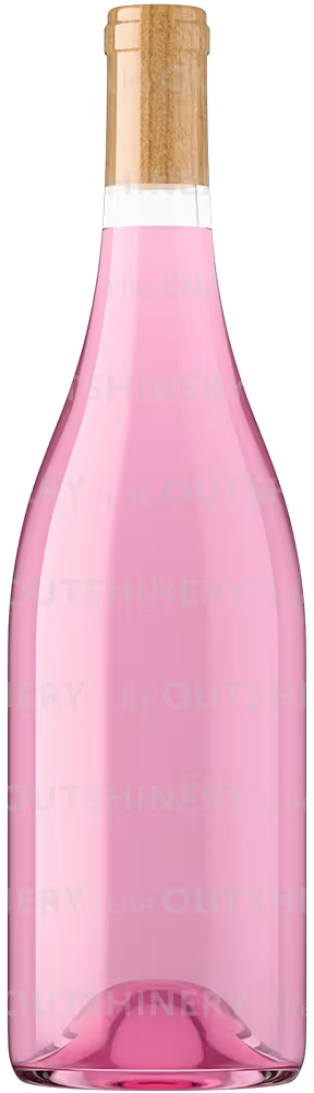
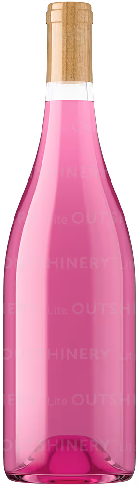
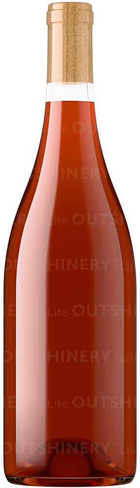
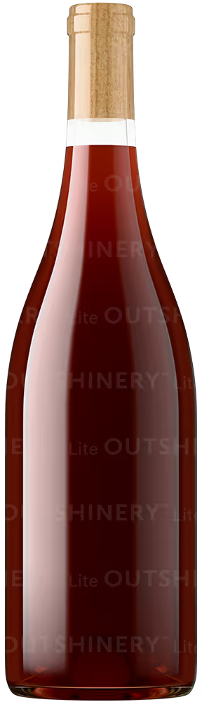
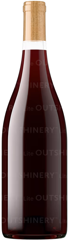
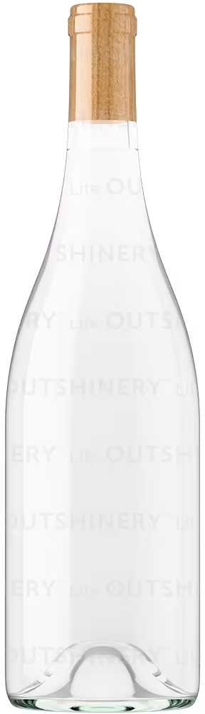
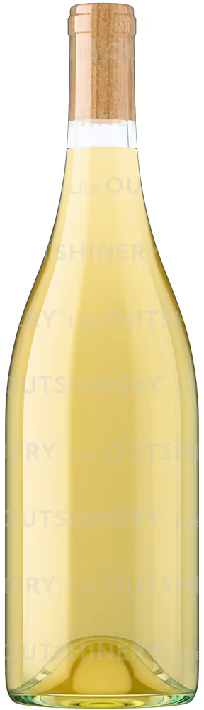
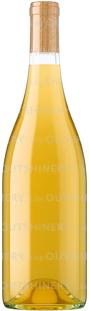
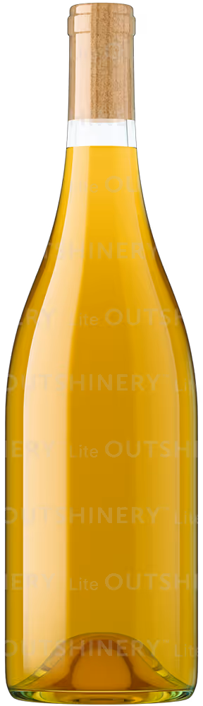
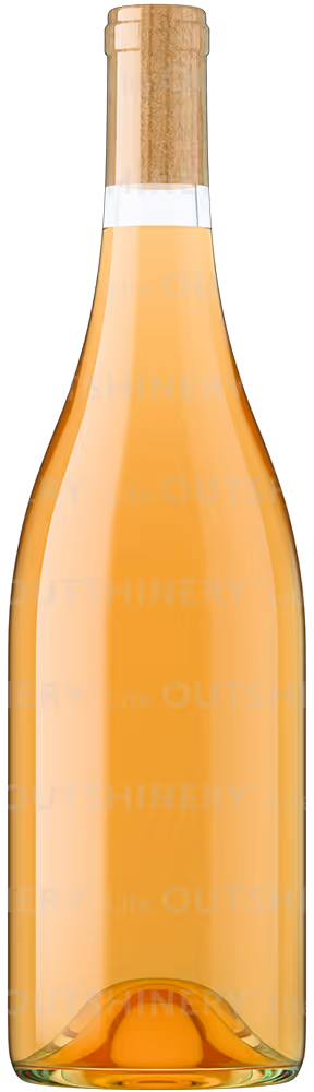
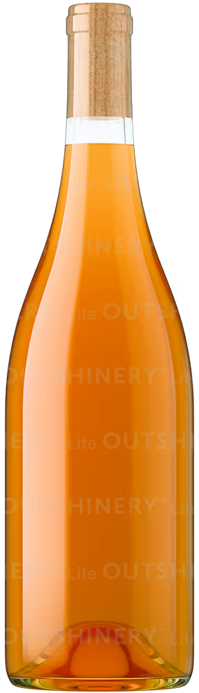
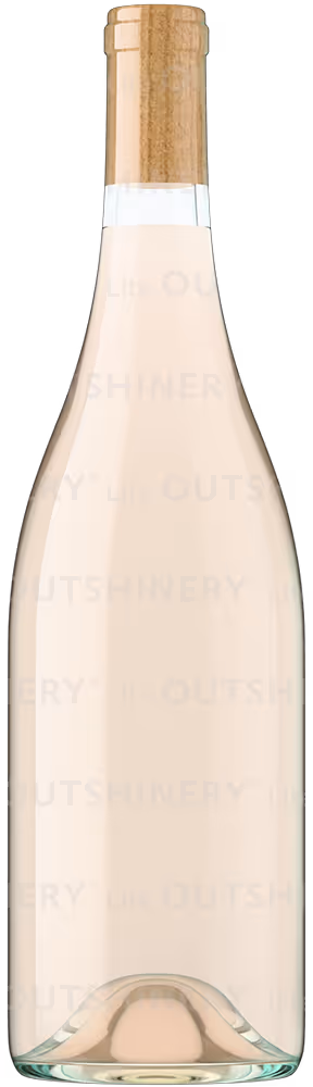
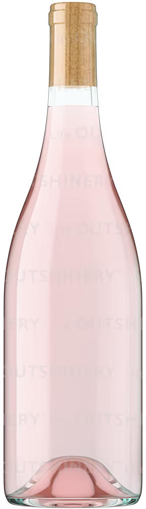
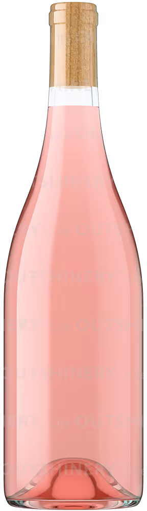
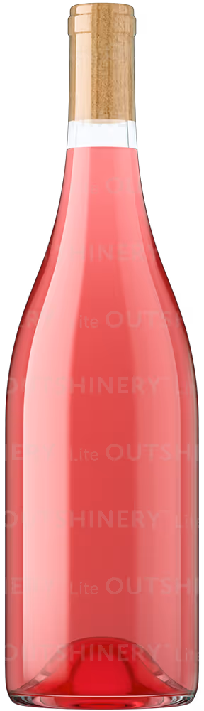
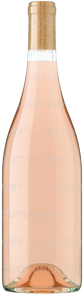
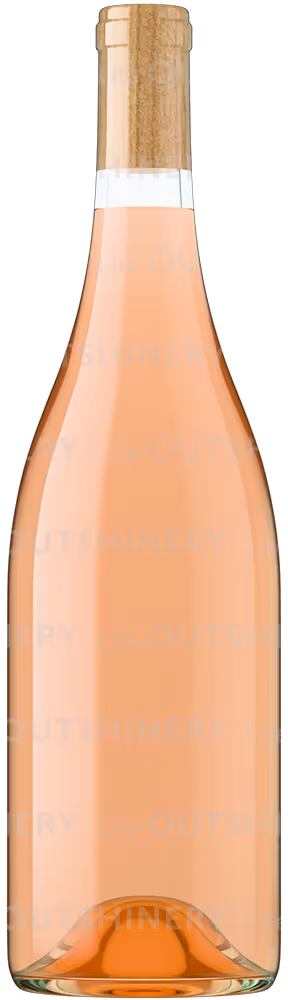
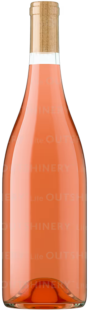
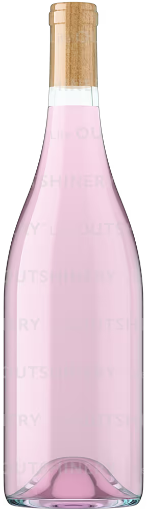
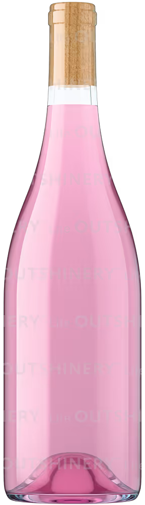
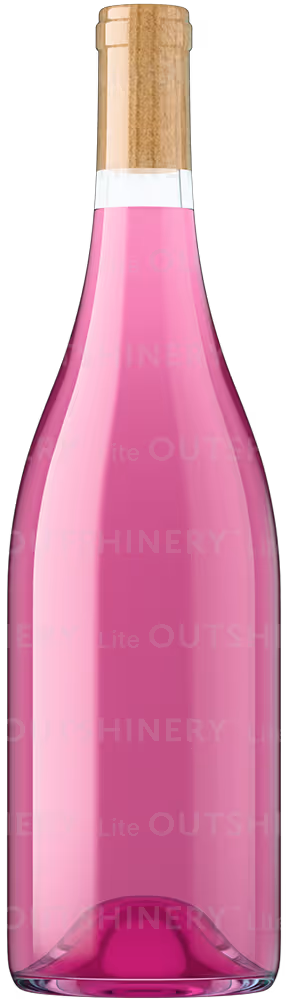
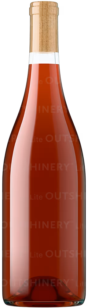
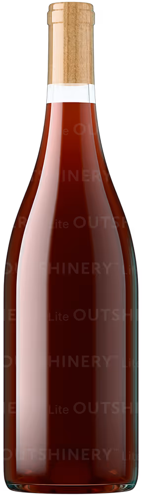
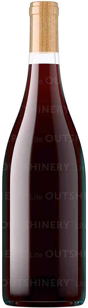
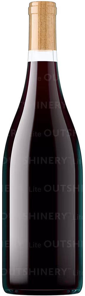
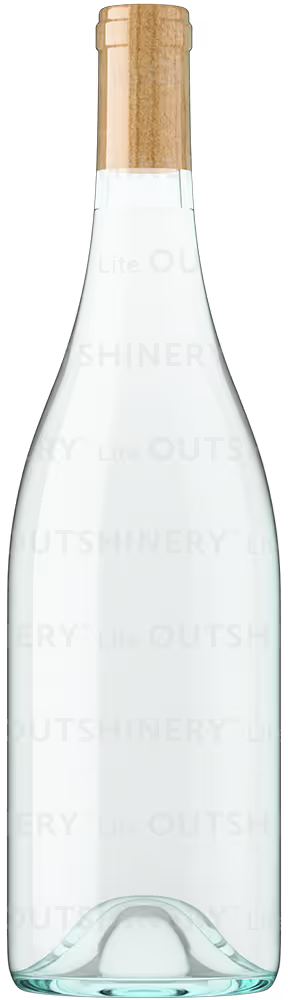
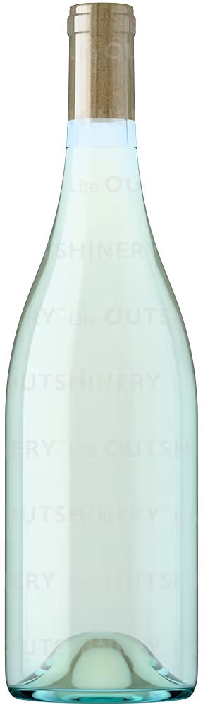
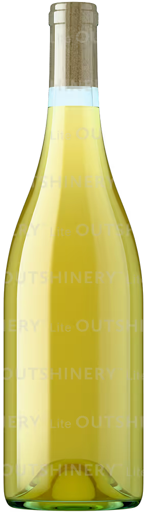
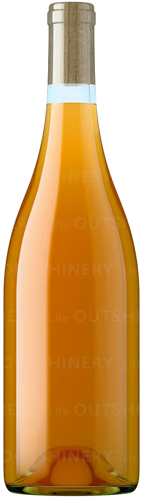
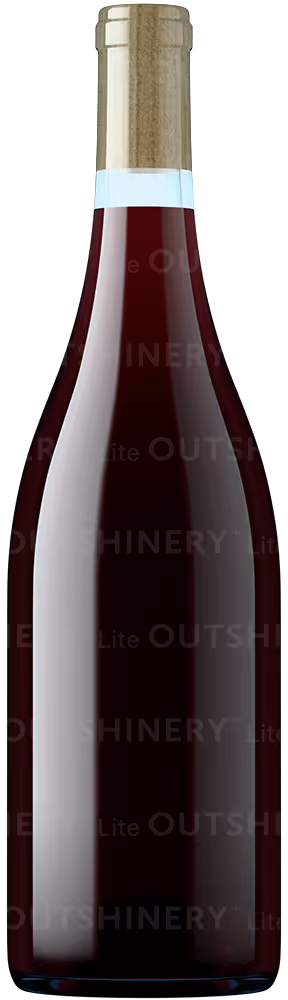
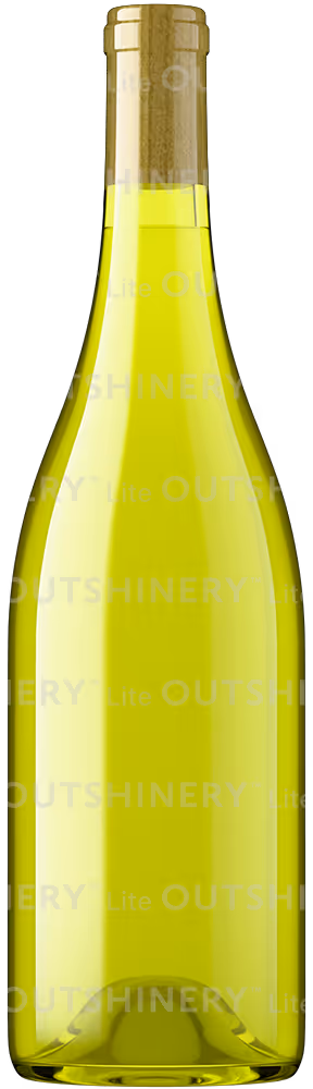
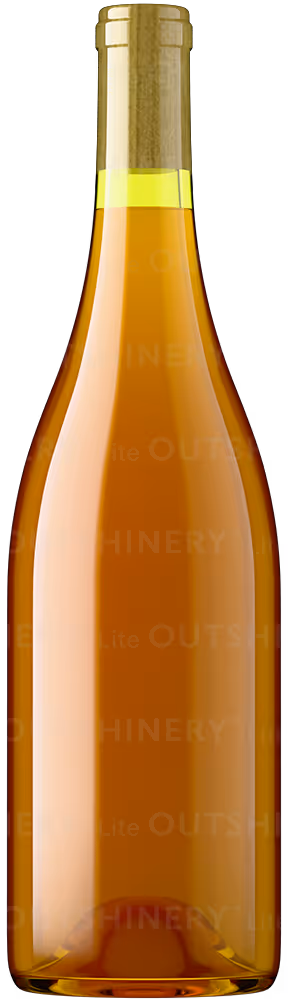
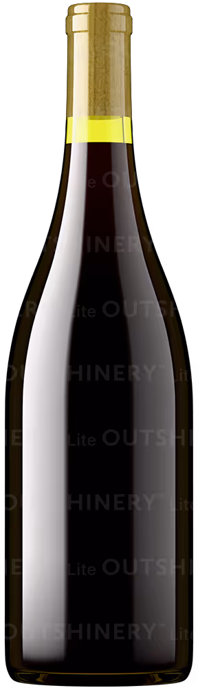
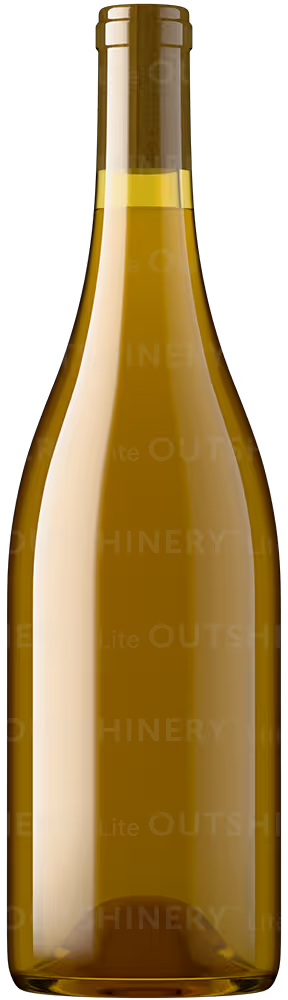
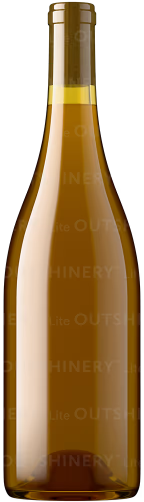
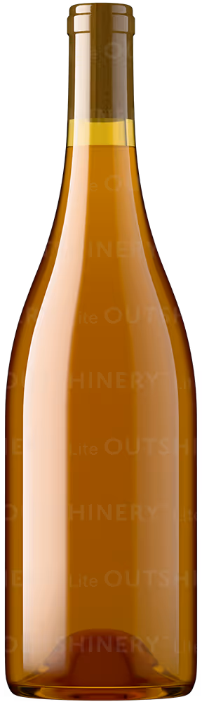
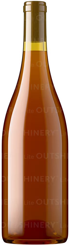
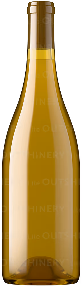
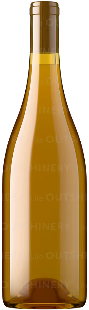
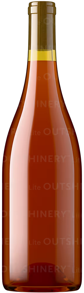
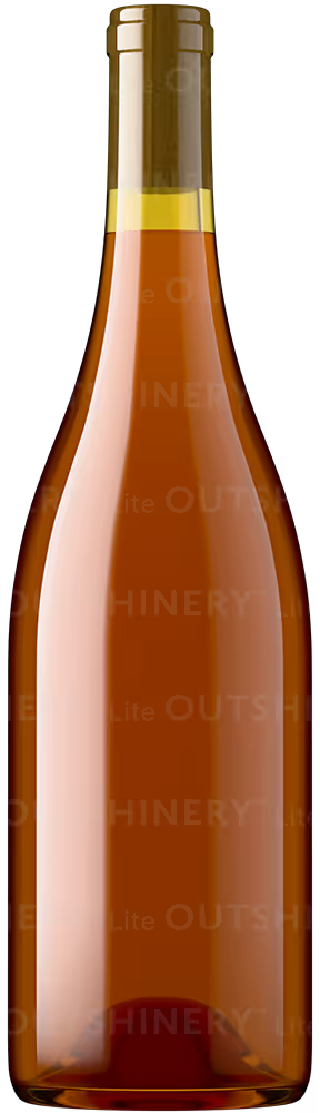
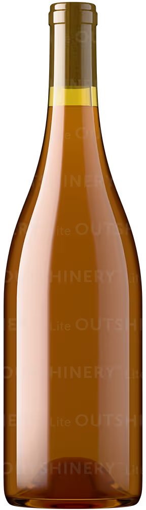
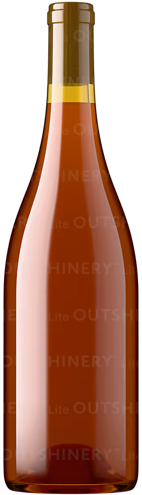
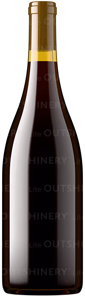
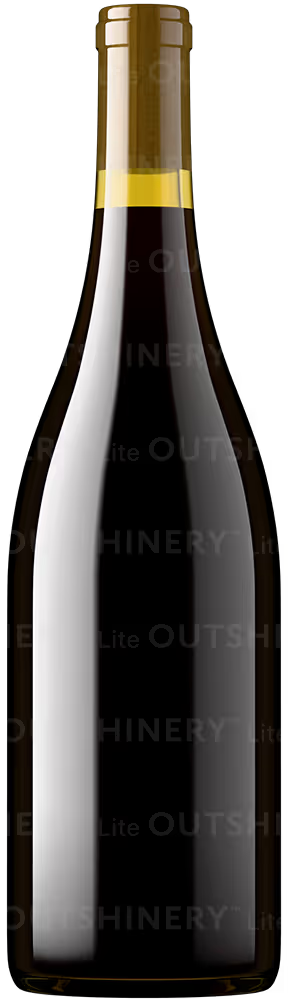
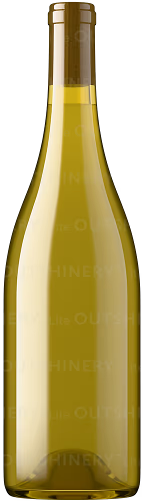
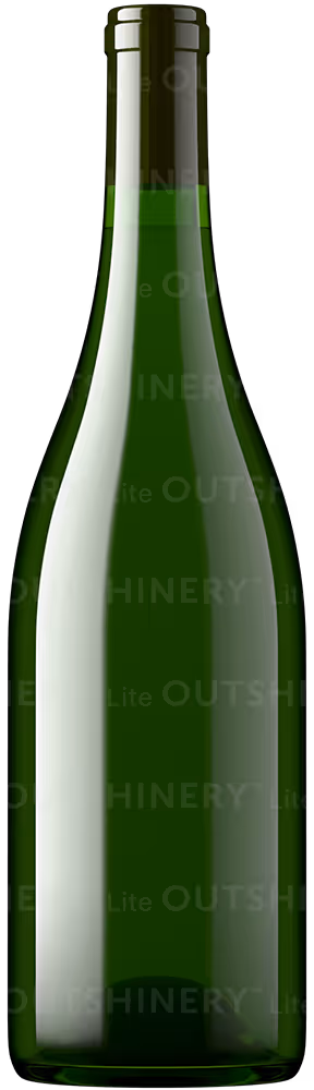
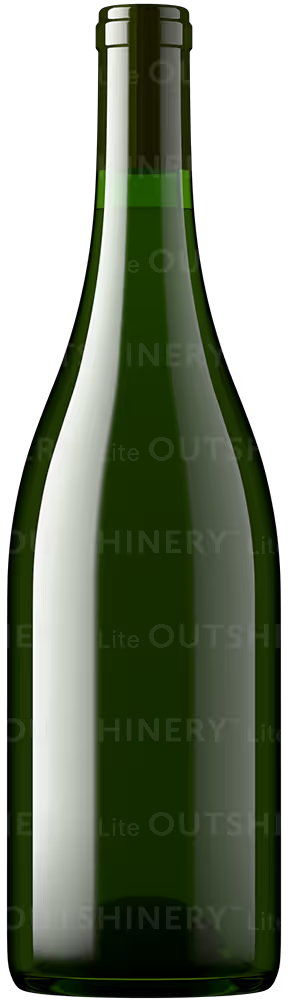
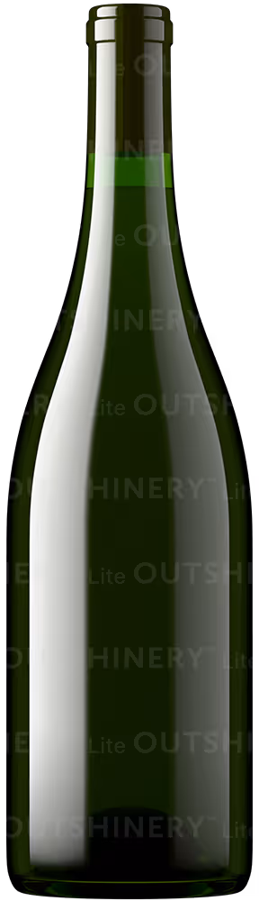
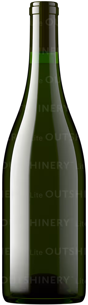
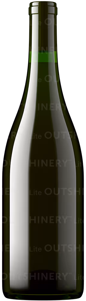
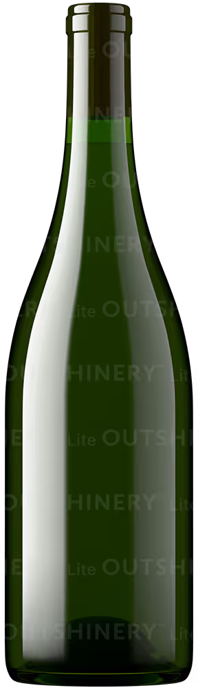
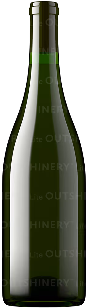
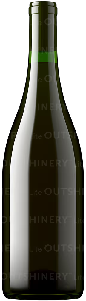
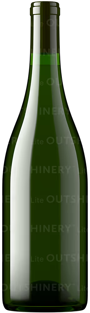
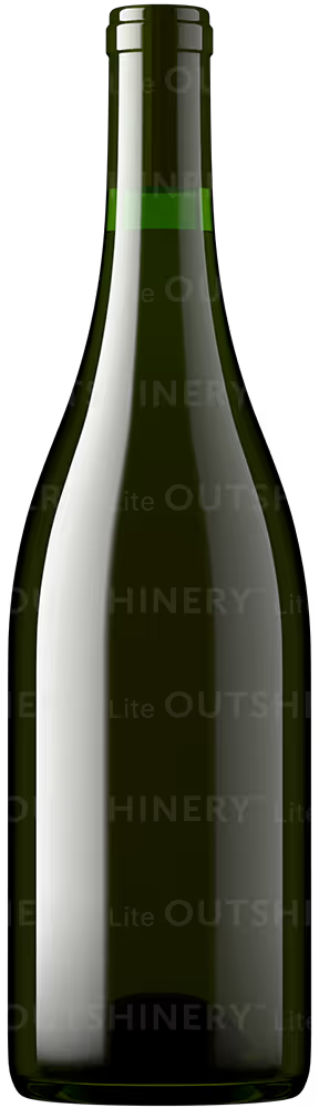
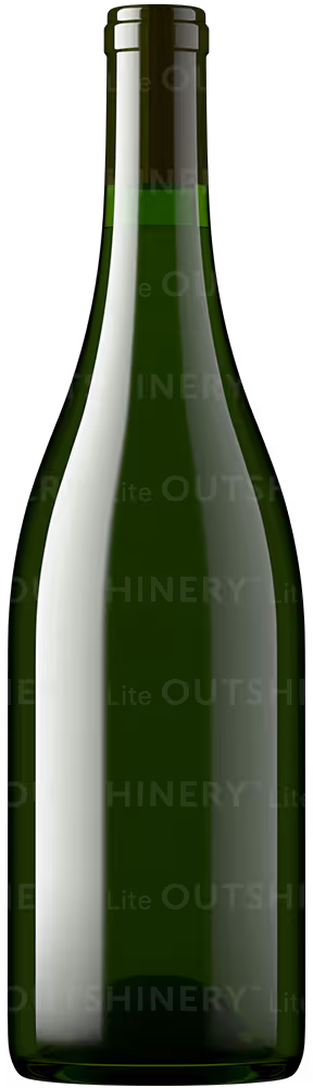
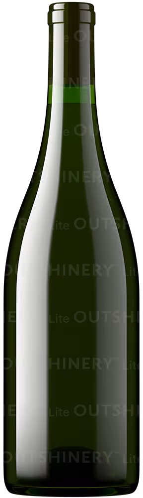
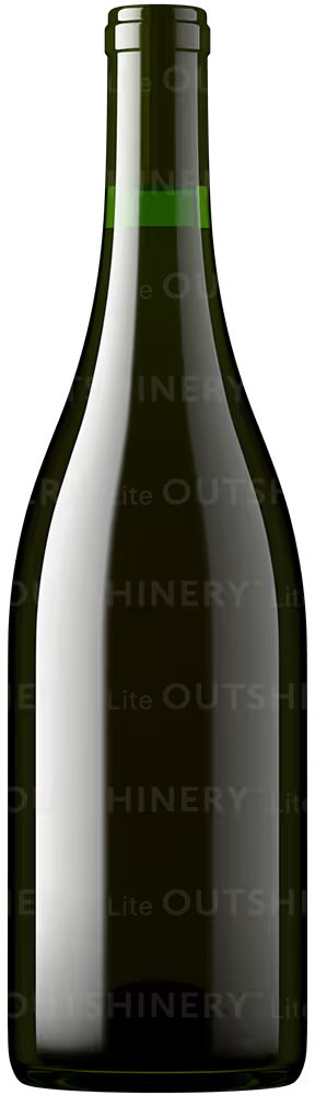
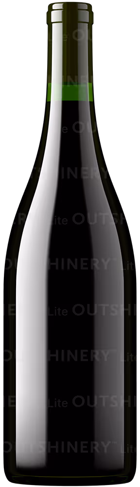
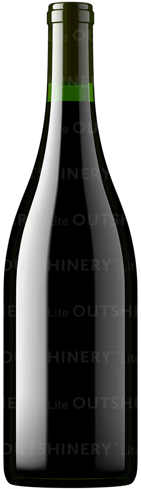
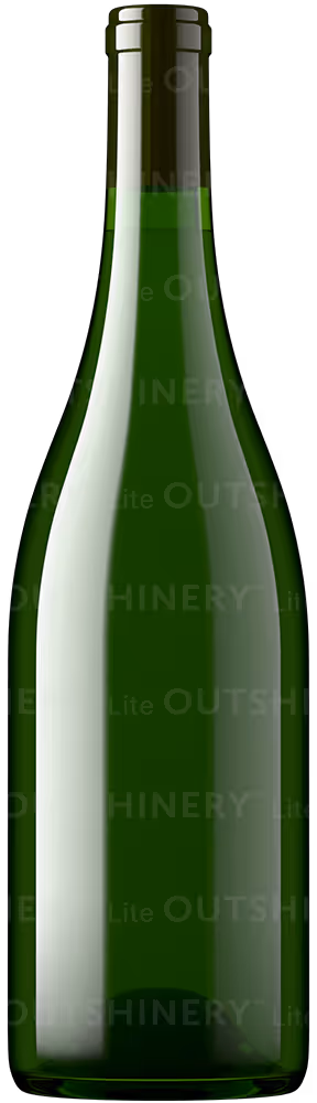
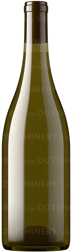
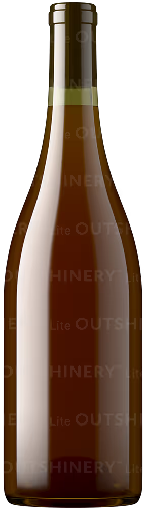
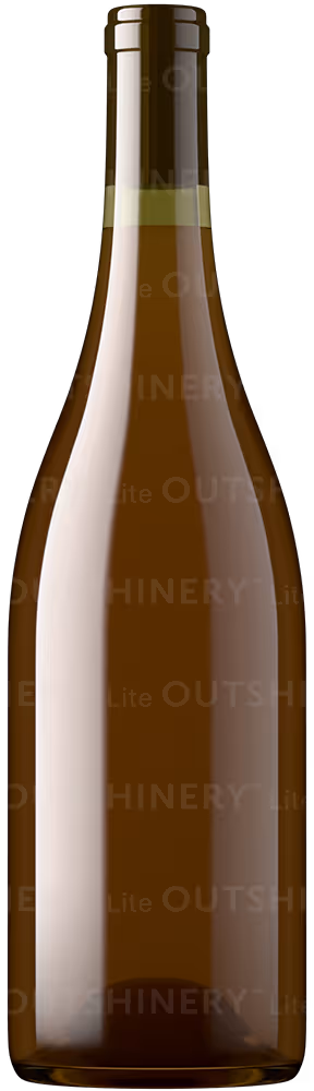
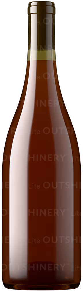
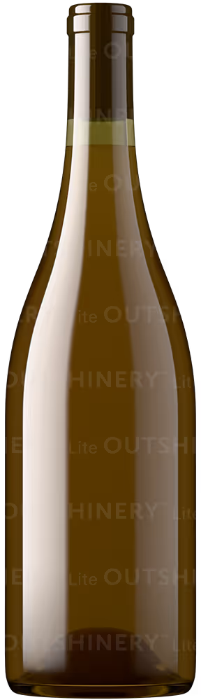
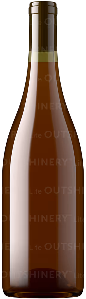
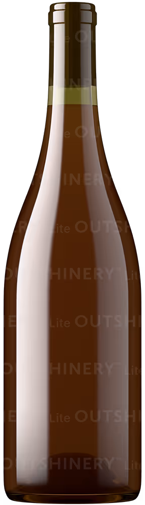
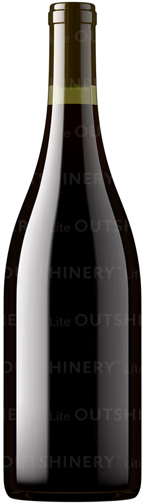
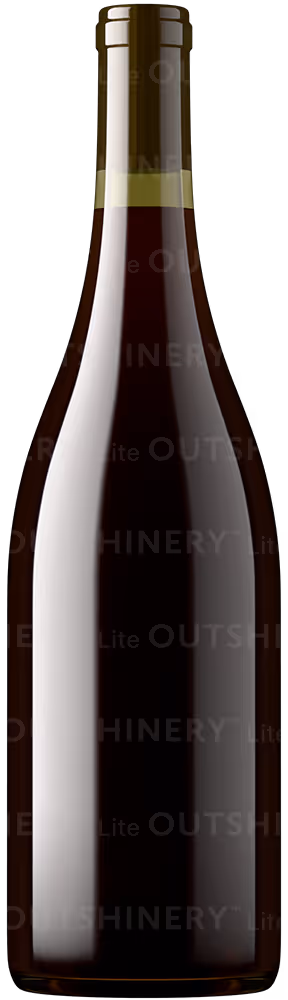
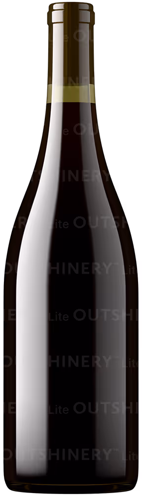
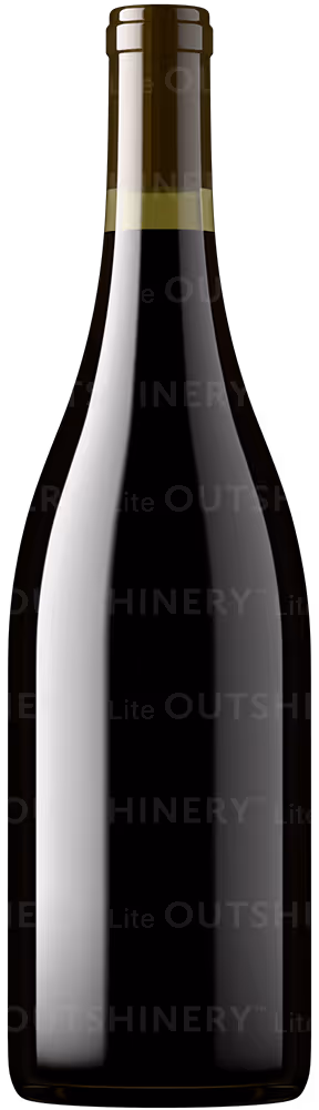
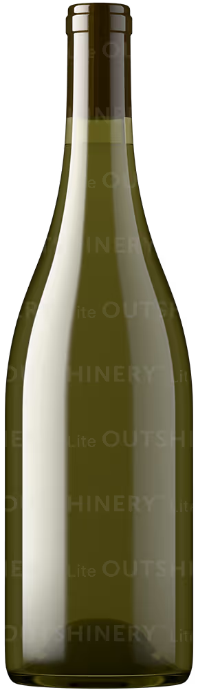
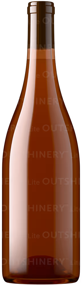
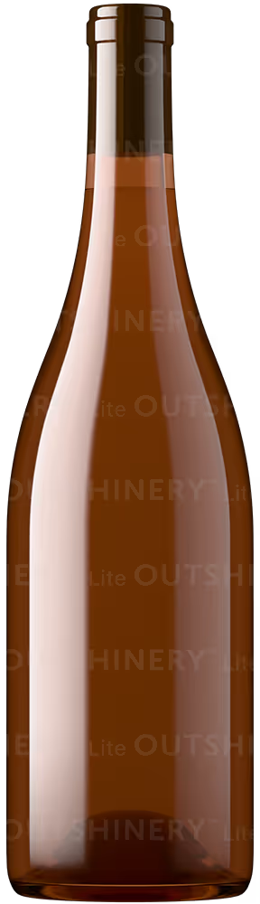
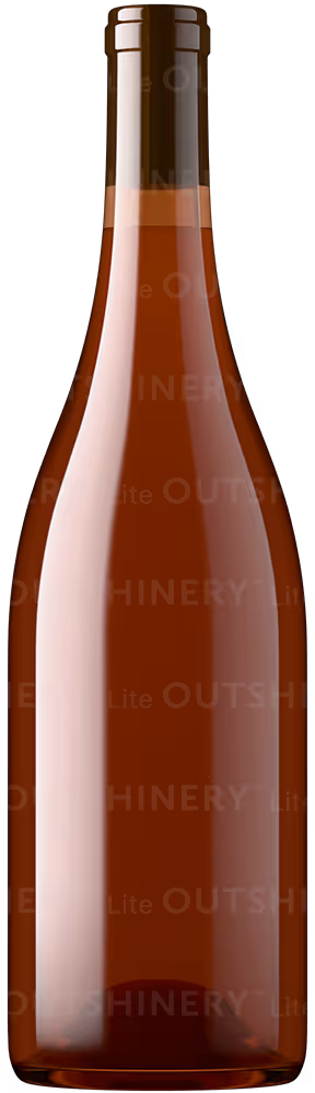
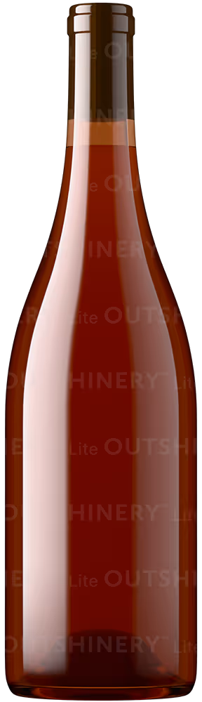
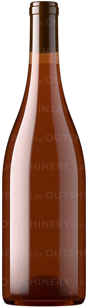
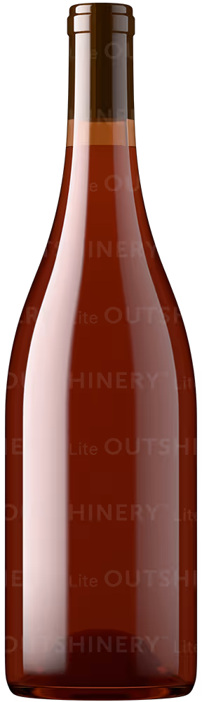
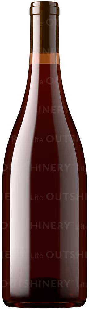
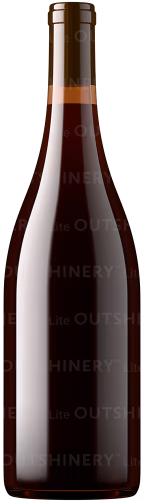
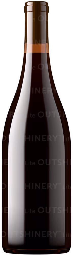
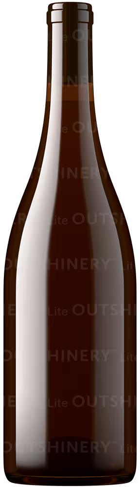
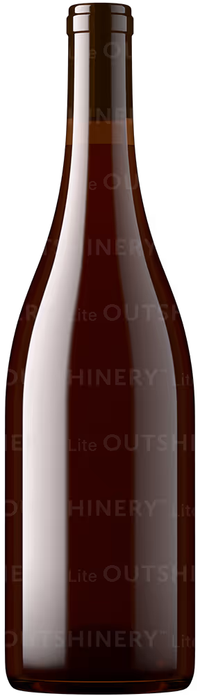
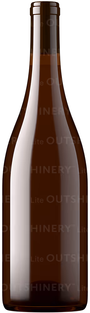
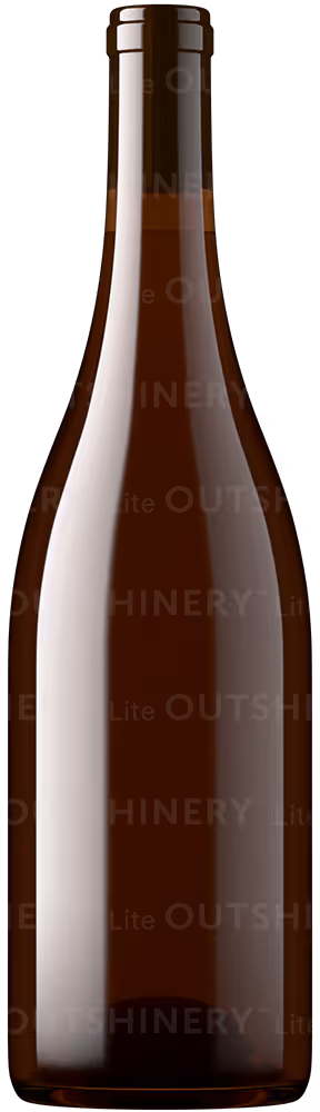
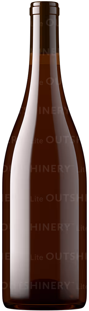
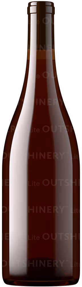
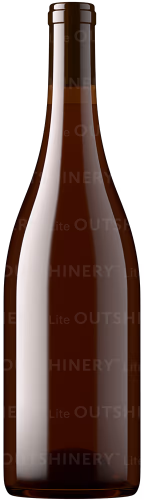
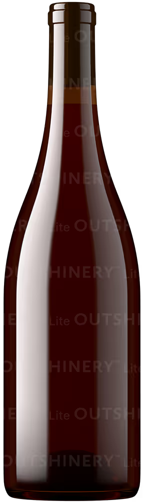
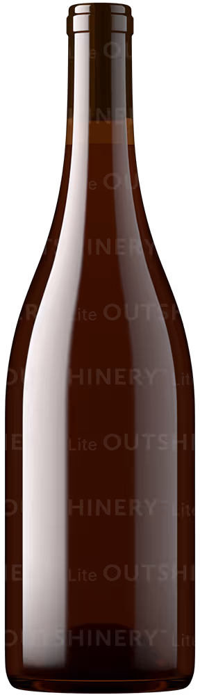
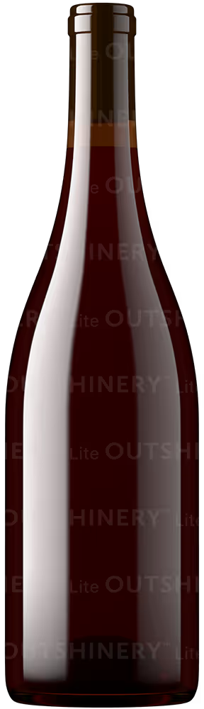
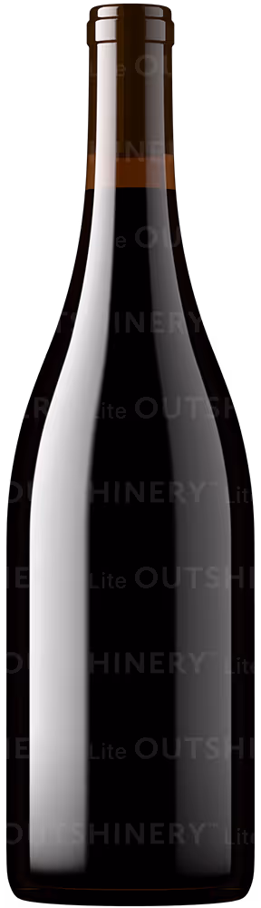
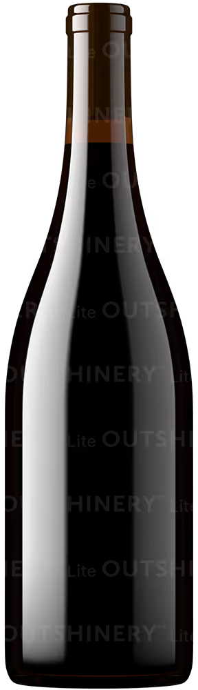
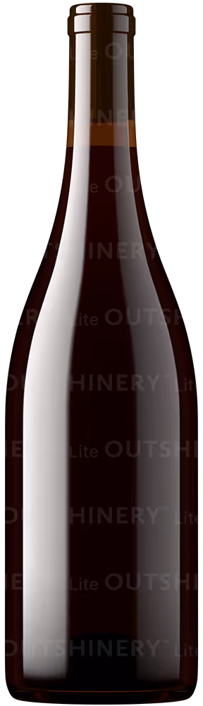
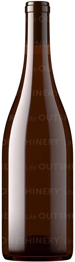
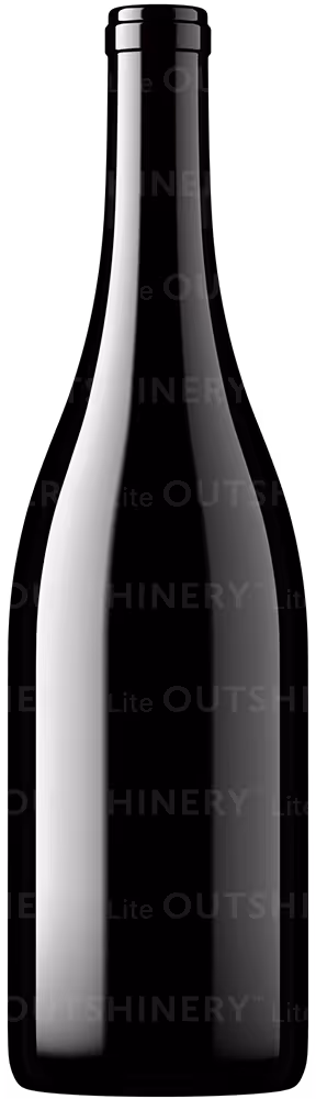
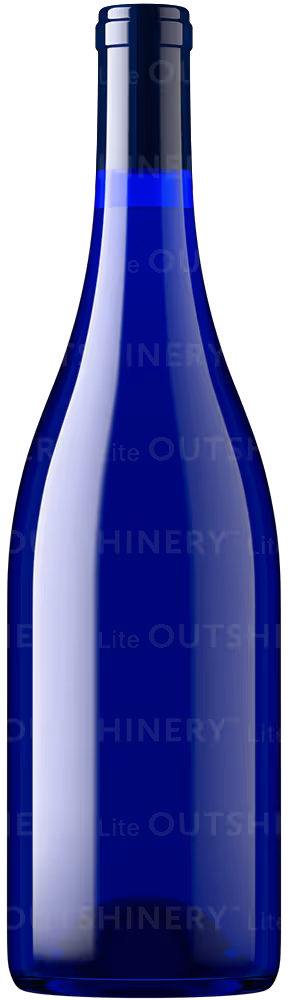
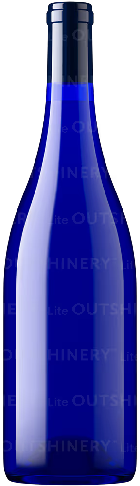
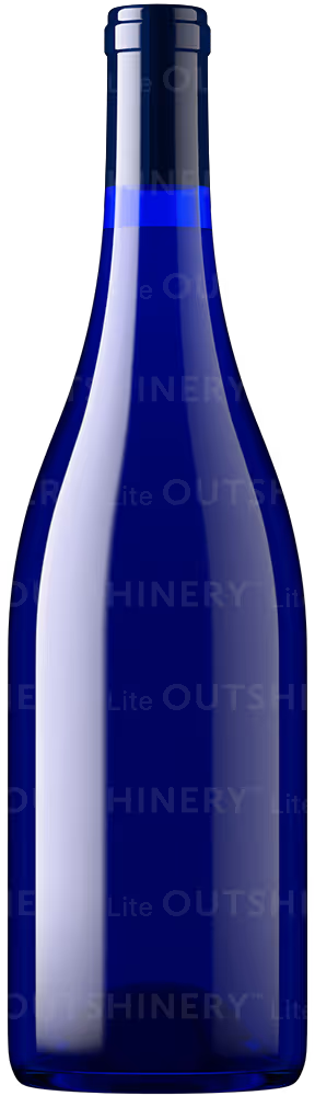
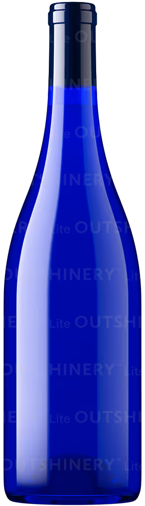
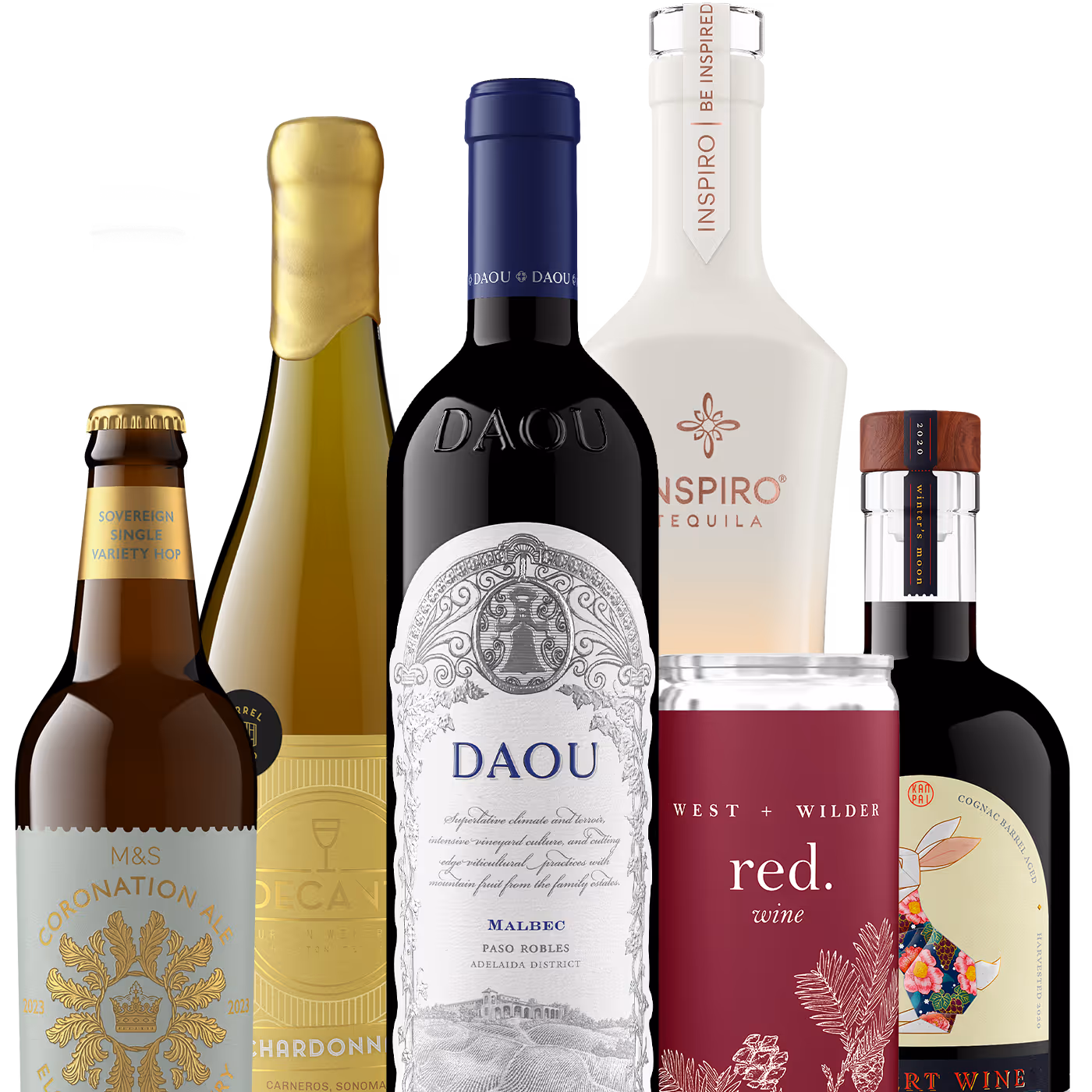
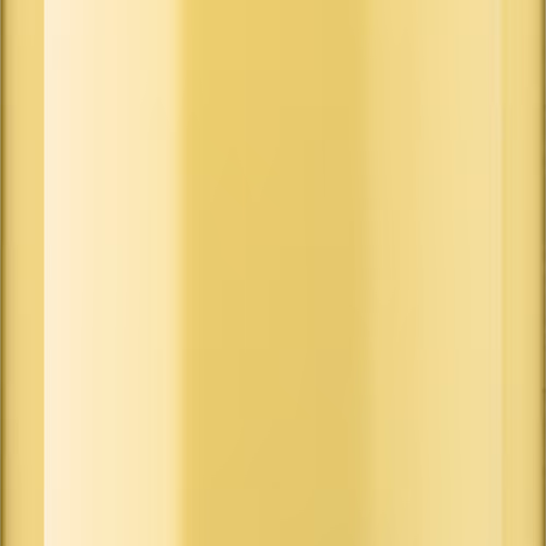
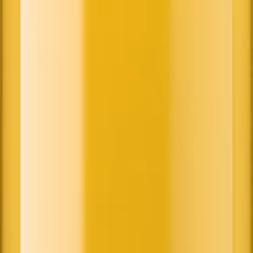
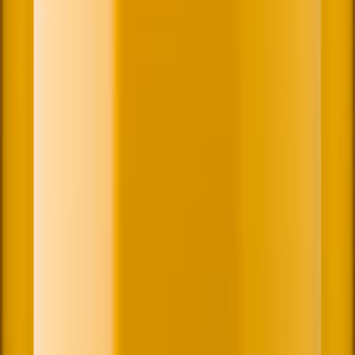
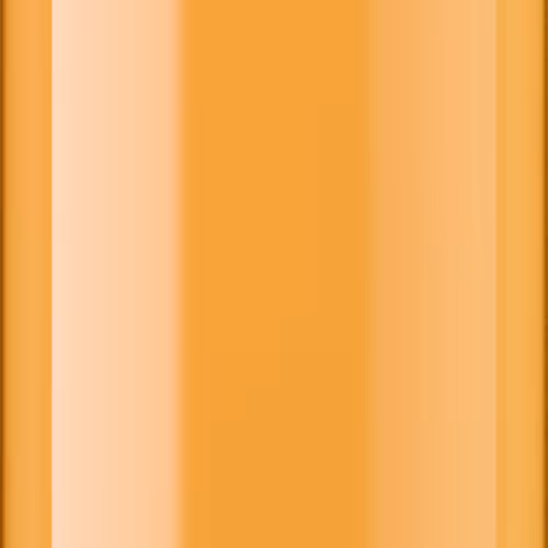
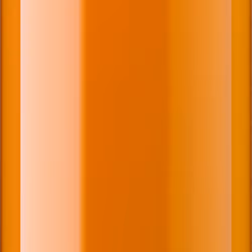
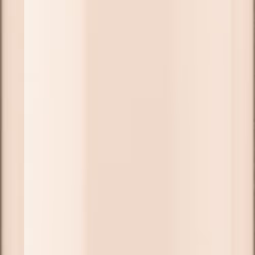
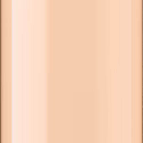
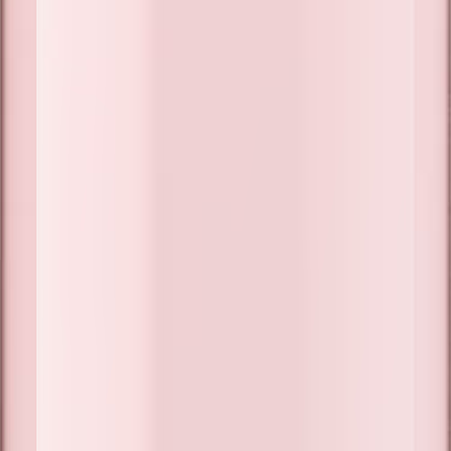
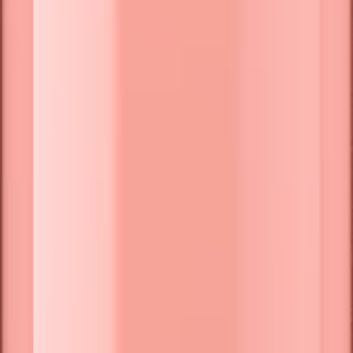
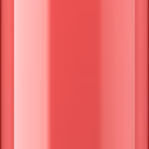
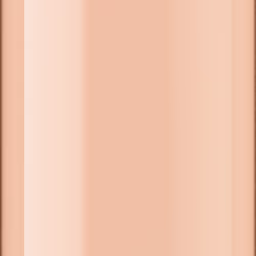
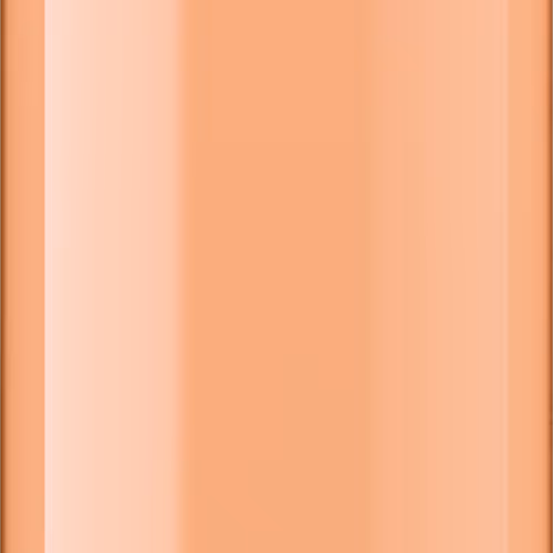
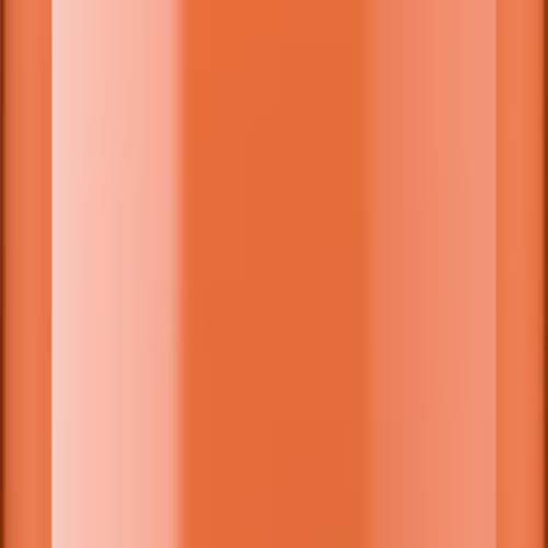
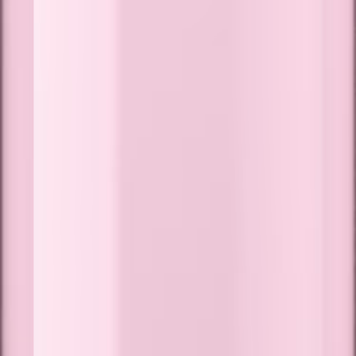
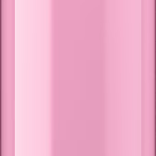
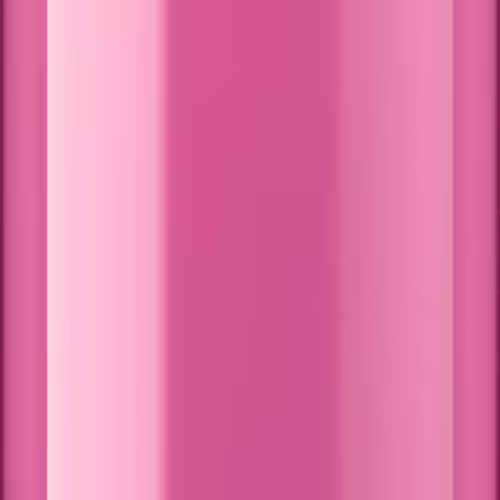
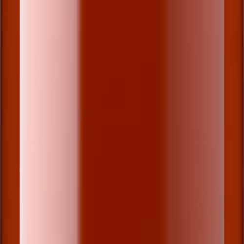
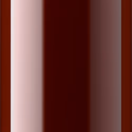
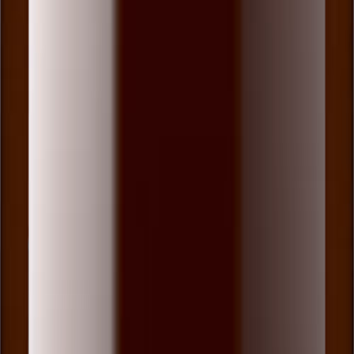
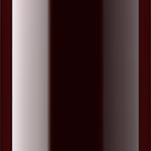
Color combos
Get a true sense of how your wine appears through different glass shades, and choose the ideal combination before ordering your bottle shot online.
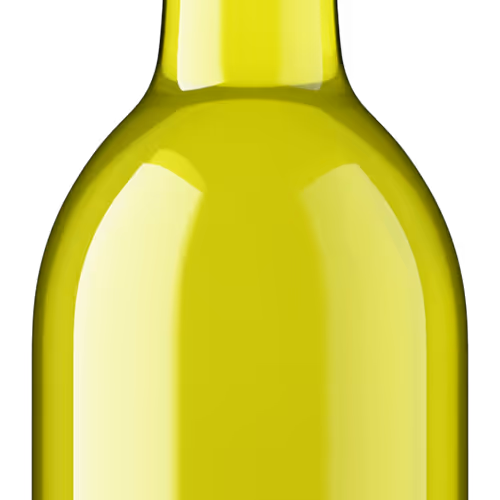
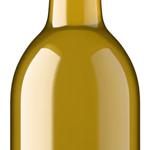
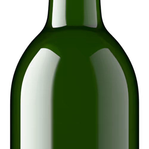
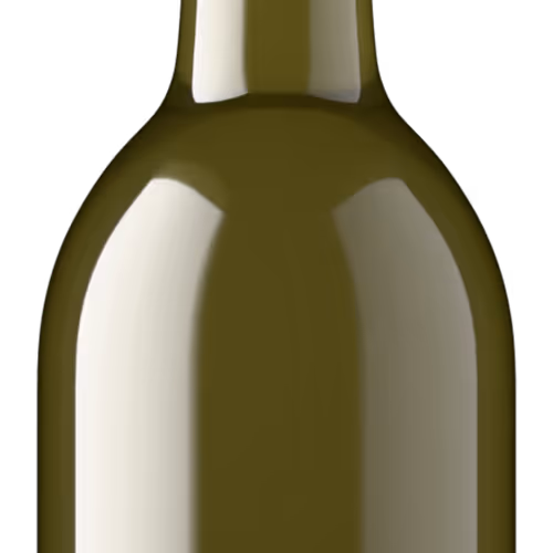
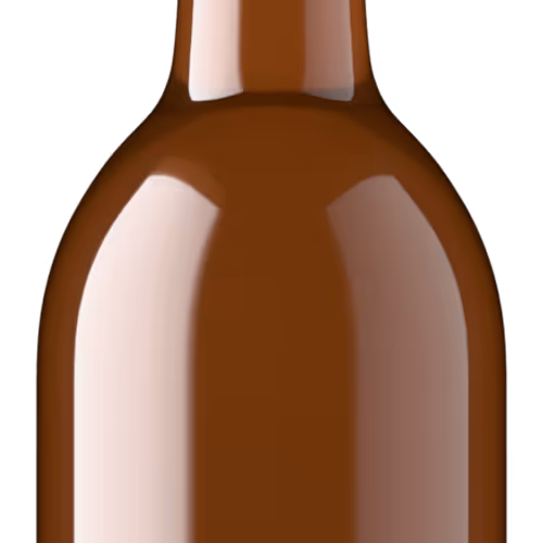
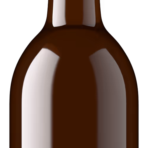
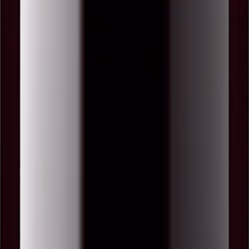
Standard or hazy? Your choice.
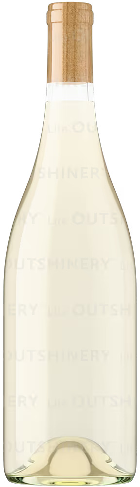
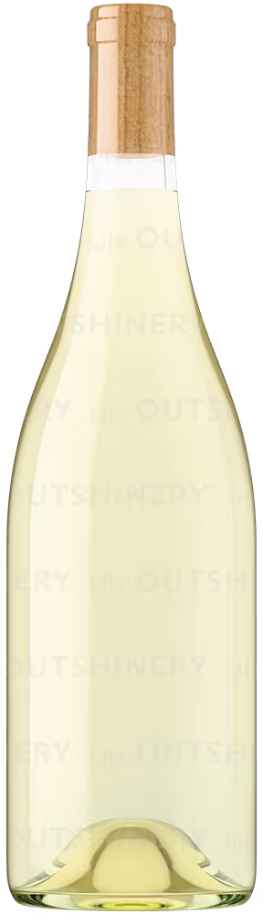
Every wine shade in Outshinery Lite comes in two options:
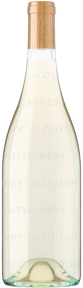
- Standard liquid: classic clarity and brightness, ideal for traditional wines.
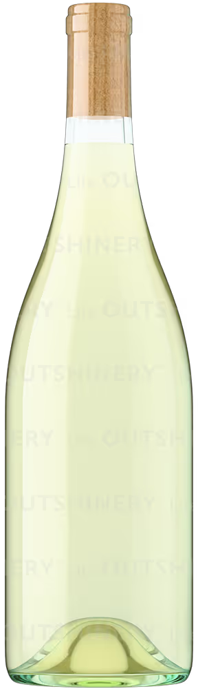
- Hazy liquid: a softly diffused, naturally unfiltered look that’s perfect for natural wines, pét-nats, or ciders.
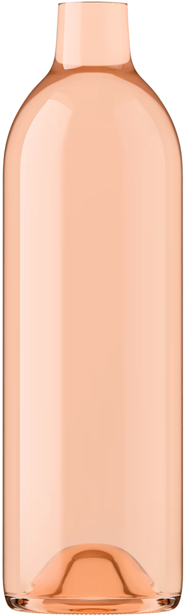
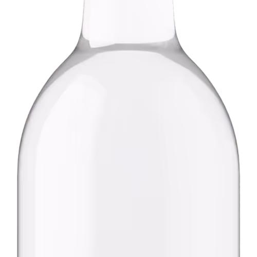
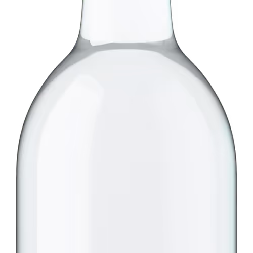
Standard Liquid
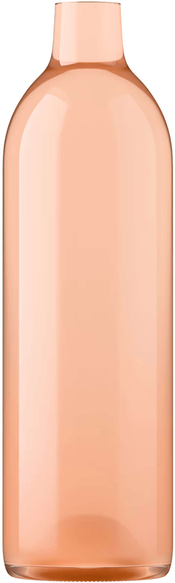
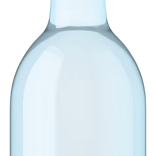
Hazy Liquid
%20-%20Pale%20Straw-Trademark.avif)
%20-%20Lemon-Green-Trademark.avif)
%20-%20Straw-Yellow-Trademark.avif)
%20-%20Gold-Trademark.avif)
%20-%20Deep%20Gold.avif)
%20-%20Light%20Amber.avif)
%20-%20Amber-Trademark.avif)
%20-%20Pale%20Copper.avif)
%20-%20Copper%20-%20Onion-Skin-Trademark.avif)
%20-%20Pale%20Pink-Trademark.avif)
%20-%20Medium%20Pink.avif)
%20-%20Deep%20Pink.avif)
%20-%20Pale%20Salmon.avif)
%20-%20Salmon%20Pink-Trademark.avif)
%20-%20Deep%20Salmon.avif)
%20-%20Pale%20Berry.avif)
%20-%20Medium%20Berry.avif)

%20-%20Pale%20Garnet-Trademark.avif)
%20-%20Garnet-Trademark.avif)
%20-%20Tawny%20-%20Brown-Trademark.avif)
%20-%20Ruby%20Red-Trademark.avif)
%20-%20Tyrian%20Purple-Trademark.avif)
%20-%20Clear-Trademark.avif)
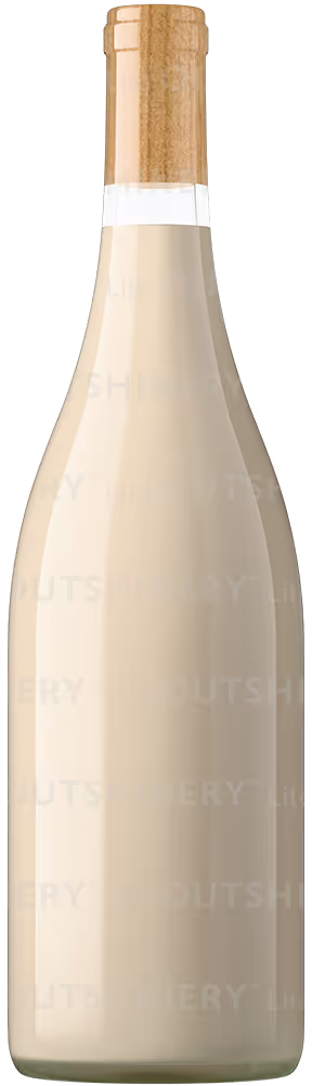
%20-%20Dark%20Cream%20-%20Latte.avif)